When you’re preparing to sell in Venice, Florida, the right paint colors can be the simplest, most cost-effective way to elevate your home’s appeal and perceived value. As a local REALTOR with WATERSEDGE REALTY GROUP, LLC, I’ve walked hundreds of buyers through homes from Venice Island to South Venice, Pelican Pointe, Plantation, and the growing Wellen Park communities. Time and again, color choices either help a listing shine—or hold it back. This guide draws on what Venice buyers respond to today, how our Gulf Coast light affects color, and how to select a palette that complements Venice’s Mediterranean-inspired architecture and contemporary new builds alike.
Elevating Your Venice, Florida Home's Value Through Paint Color Selection
- Understanding the Impact of Paint Colors on Home Value in Venice, Florida.
Fresh, thoughtfully chosen paint signals a well-maintained home and helps buyers picture their life in it. In Venice, our bright, coastal light makes colors look cleaner and cooler than they do up north. Whites feel crisper, grays can read slightly blue, and beiges can skew pink if you pick the wrong undertone. Repainting to a cohesive, neutral palette widens your buyer pool, minimizes objections, and photographs beautifully—crucial for getting attention online. In older South Venice ranches, new paint modernizes dated spaces. In newer Wellen Park homes, the right tones enhance open layouts and tie together tile, quartz, and luxury vinyl plank flooring.
- Choosing the Right Paint Colors for Maximum Appeal and ROI in Venice, Florida.
For top return on investment, choose light-to-medium neutrals with balanced undertones, keep the palette consistent across common areas, and touch every room that looks tired on a walkthrough. Prioritize high-traffic spaces buyers scrutinize: living areas, kitchen, primary suite, and entry. Use durable, mildew-resistant formulas suited to Florida humidity for baths and exteriors. The goal is a clean, current feel without veering into personal taste that might limit the buyer pool.
General Rules for Painting Your Venice, Florida Home Before Listing
1. Opt for Neutral Paint Colors in Venice, Florida
- The Universal Charm of Neutral Tones in Venice, Florida.
Neutral doesn’t mean boring. In Venice, neutrals complement our Mediterranean Revival exteriors, barrel-tile roofs, palm-lined streets, and the coastal lifestyle buyers seek. Light greiges, warm whites, and softened taupes pair well with the travertine-look tile and plank floors prevalent in Pelican Pointe, Plantation, and many Venice Island condos.
- Creating a Neutral Canvas: Key to Selling Your Venice, Florida Home.
A unified, neutral backdrop lets buyers focus on key features—vaulted ceilings, lanais, water or preserve views—rather than on paint. Choose a main color with a Light Reflectance Value (LRV) around 60–75 to bounce the abundant Gulf light and make rooms feel larger. Carry it through the living room, dining, kitchen, and halls. This cohesion is especially important in open-concept homes common in Wellen Park and Venice East.
- Avoiding Bold and Distracting Colors in Venice, Florida.
Bright accents—teal feature walls, deep reds, or intense yellows—can overwhelm in our bright sun and turn up as “must fix” items on buyer feedback. If you love coastal color, use accessories or art and keep walls neutral for the sale. Save bolder shades for small, highly styled spaces only if they truly enhance the architecture.
2. Consider the Undertone: A Venice, Florida Perspective
- The Significance of Undertones in Venice, Florida Home Painting.
Undertones determine whether a “gray” reads blue, green, or purple, and whether a “beige” skews yellow or pink. In Venice’s clear, high-intensity light, cool undertones become more pronounced. That beautiful cool gray you saw online can go chilly once the afternoon sun bounces off pavers, water, or bright white lanais.
- Undertones That Harmonize with Venice, Florida's Unique Features.
Think about fixed elements: tile, counters, cabinets, and roof color. Many Venice homes have warm-toned floors, cream or white cabinets, and quartz with subtle veining. Greiges with soft beige undertones or warm whites with a drop of gray balance nicely with these finishes. If you have gray porcelain tile or white oak tones popular in newer builds, choose a slightly warmer gray to avoid a sterile feel.
- Selecting Warm, Cool, or Neutral Undertones for Venice, Florida Homes.
Warm or neutral-leaning undertones are safest for broad buyer appeal. Reserve cooler hues for specific moments—like a soothing bath—where they feel spa-like rather than cold. Always sample on multiple walls and check morning and afternoon light; what works on Venice Island with bright exposure may read differently in a shaded South Venice lot beneath live oaks.
3. Follow Venice, Florida Neighborhood Trends
- Gauging Paint Color Trends in Venice, Florida's Real Estate Market.
On Venice Island and in the historic districts, you’ll see creamy stucco exteriors with soft beige or greige body colors and crisp white trim. In communities like Gran Paradiso and other Wellen Park villages, interiors favor light greige walls with white trim and cabinetry for a fresh, modern coastal vibe. Touring active listings with a local agent helps you see what’s resonating right now in your price point.
- Balancing Personal Preferences and Venice, Florida Community Expectations.
Some HOAs—common in Pelican Pointe, Plantation, Venetian Falls, and Wellen Park—have approved exterior color palettes. Stay within those guidelines, but choose the freshest, most current option on the list. Inside, neutrality rules; use personal color in movable accents, not on the walls.
- Adapting to Venice, Florida Architectural Styles and Neighborhood Vibes.
Mediterranean Revival homes look best with warm whites and sand-toned body colors accented by deeper, earthy trim. Contemporary homes can handle crisper whites with charcoal or soft black accents. Older block homes in South Venice benefit from a unified light-neutral interior that brightens smaller rooms and hallways, making them feel more open.
Best Paint Colors for Selling a Venice, Florida House: Room By Room
Common Areas: Living, Dining, and Hallways in Venice, Florida
- The Great Gray vs. Beige Debate in Venice, Florida.
In our market, the “greige” middle ground wins. True cool grays often feel stark under Florida sun, while classic beiges can read dated. Greige delivers warmth and modernity, bridging white kitchens and warmer floors.
- The Allure of Warm Gray Tones: A Venice, Florida Favorite.
Warm grays soften the glare of bright days while staying fresh. They work with both coastal blues and organic textures like rattan and driftwood that buyers love.
- Top Paint Color Recommendations for Venice, Florida Common Areas.
Consider these proven, buyer-friendly shades:
- Sherwin-Williams Agreeable Gray (SW 7029): A market favorite greige that stays balanced in bright light.
- Sherwin-Williams Repose Gray (SW 7015): Slightly cooler than Agreeable Gray but still warm enough for Venice.
- Sherwin-Williams Accessible Beige (SW 7036): Ideal for homes with warmer floors; never reads pink.
- Sherwin-Williams Aesthetic White (SW 7035): A whisper-light greige for smaller spaces that need lift.
- Benjamin Moore Edgecomb Gray (HC-173): Soft, inviting greige that plays well with white cabinets.
- Benjamin Moore Classic Gray (OC-23): Airy and elegant for open-plan living rooms and halls.
- Benjamin Moore Pale Oak (OC-20): A light, sophisticated greige that flatters coastal decor.
For trim, doors, and ceilings, use a clean white such as Sherwin-Williams Pure White (SW 7005) or Benjamin Moore White Dove (OC-17) to create crisp contrast.
Venice, Florida Kitchen Painting Strategies
- Coherence Across Venice, Florida Homes: Consistency is Key.
Carry your main wall color from the living area into the kitchen to maintain flow, especially in open layouts. With white or off-white cabinetry, a soft greige wall color avoids glare and highlights counters and backsplash.
- Adding Dimension to Venice, Florida Kitchens: Creative Shade Choices.
If you want visual interest, add depth through the island or a pantry door rather than full accent walls. Thoughtful choices include:
- Island accent: Benjamin Moore Hale Navy (HC-154) or Sherwin-Williams Cyberspace (SW 7076) for a classic, upscale coastal note.
- Gentle coastal wall tone: Sherwin-Williams Sea Salt (SW 6204) reads softly blue-green in our light—use sparingly to keep mass appeal.
- Warm white walls with contrast: Sherwin-Williams Alabaster (SW 7008) on walls, with a slightly brighter Pure White (SW 7005) on trim.
- Venice, Florida Cabinet Painting: Safety in White or Other Options.
White cabinets remain the safest bet for Venice buyers:
- Sherwin-Williams Alabaster (SW 7008): Warm, welcoming white.
- Benjamin Moore Chantilly Lace (OC-65): Bright, clean white for modern kitchens.
- Benjamin Moore Swiss Coffee (OC-45): Soft, creamy white that pairs well with warm floors.
Choose a durable, cabinet-grade enamel. For walls, use scrubbable satin or eggshell; semi-gloss for trim. Given our humidity, prioritize mildew-resistant formulas and proper ventilation during and after painting.
Bedrooms: Venice, Florida's Unique Considerations
- The Role of Bedrooms in Venice, Florida Homebuyer Decisions.
Primary suites and guest rooms matter, especially with our mix of move-up buyers, retirees hosting family, and seasonal residents. Calm, spa-like palettes sell the restful lifestyle Venice promises.
- Cost-Effective Bedroom Repainting: A Venice, Florida Analysis.
If your main living areas look fresh but bedrooms show scuffs or dated colors, repainting bedrooms offers excellent ROI. Stick to the same neutral family used in common areas for continuity. A slightly softer, lighter shade in bedrooms enhances tranquility and photographs well for listing photos.
- Consulting Venice, Florida Real Estate Experts on Bedroom Colors.
Based on local buyer feedback, these bedroom colors perform well:
- Sherwin-Williams Silver Strand (SW 7057): A gentle gray with subtle green that feels serene in our light.
- Benjamin Moore Balboa Mist (OC-27): Cozy without closing in the space.
- Benjamin Moore Classic Gray (OC-23): Universally flattering in guest rooms.
- Sherwin-Williams Crushed Ice (SW 7647): Soft, modern neutral for secondary bedrooms.
Keep ceilings clean white to maximize height, and use consistent white trim to unify the home.
Bathroom Paint Choices in Venice, Florida
- Venice, Florida Bathroom Design: A Touch of Personality.
Bathrooms can handle a hint of spa color, but keep it airy and sophisticated. Choose paints formulated for high humidity and mildew resistance, especially in windowless baths.
- Coordinating Venice, Florida Bathroom Colors: Options and Effects.
Match undertones to your tile. For travertine or beige tile, warm greige walls like Accessible Beige keep things cohesive. For gray porcelain tile, a soft greige or a delicate blue-green reads fresh without going cold.
- Top Bathroom Paint Recommendations for Venice, Florida Homes.
Try these buyer-friendly choices:
- Sherwin-Williams Sea Salt (SW 6204): Soft, spa-like coastal hue that stays subtle.
- Benjamin Moore Beach Glass (1564): Calm blue-green that complements white and gray tile.
- Sherwin-Williams Modern Gray (SW 7632): Light warm greige that flatters warm stone.
- Benjamin Moore Wickham Gray (HC-171): Airy gray with a whisper of blue for crisp bathrooms.
Use satin/pearl on walls for wipeability and semi-gloss on trim and doors.
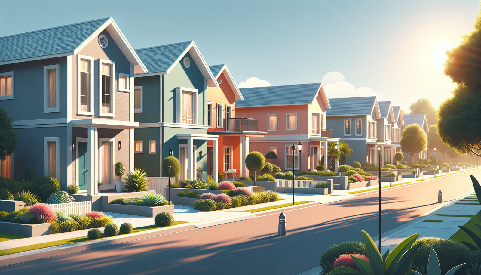
Best Paint Colors for Selling a Venice, Florida House: Exterior Facelift
- The Curb Appeal Factor in Venice, Florida's Real Estate Scene.
Curb appeal is your first showing. In Venice, sun, salt air, and humidity can dull exteriors quickly. A clean, updated exterior paint job signals low maintenance—a top priority for seasonal residents and full-time buyers alike. Before painting, pressure-wash, treat mildew, and repair stucco hairline cracks. Consider high-quality exterior acrylics or elastomeric coatings formulated for Florida climate.
- Venice, Florida Exterior Colors That Blend with the Neighborhood Style.
Always confirm HOA-approved palettes where applicable (common in Pelican Pointe, Plantation, Venetian Falls, and Wellen Park). Tie your color to your roof: barrel-tile (terra-cotta) roofs love warm whites and light beiges; darker shingle roofs can handle crisp whites or pale grays.
- Pops of Color: Venice, Florida Front Doors as Focal Points.
A tasteful front door color creates a memory point without alienating buyers. Classics that work across Venice neighborhoods:
- Navy: Sherwin-Williams Naval (SW 6244) for timeless coastal appeal.
- Charcoal/near-black: Sherwin-Williams Tricorn Black (SW 6258) for a sophisticated edge.
- Muted coastal blue-green: Benjamin Moore Wythe Blue (HC-143) for a gentle nod to the Gulf.
Pair with brushed nickel or matte black hardware for a clean, modern finish.
- Specific Exterior Paint Color Picks for Venice, Florida Homes.
Body and trim combinations that feel current and HOA-friendly:
- Warm coastal classic:
- Body: Sherwin-Williams Shoji White (SW 7042) or Natural Choice (SW 7011)
- Trim: Sherwin-Williams Pure White (SW 7005)
- Accent (shutters/garage): Sherwin-Williams Dovetail (SW 7018)
- Light greige Mediterranean:
- Body: Sherwin-Williams Aesthetic White (SW 7035)
- Trim: Benjamin Moore White Dove (OC-17)
- Door: Sherwin-Williams Naval (SW 6244)
- Soft gray contemporary:
- Body: Sherwin-Williams City Loft (SW 7631) or Light French Gray (SW 0055)
- Trim: Sherwin-Williams Extra White (SW 7006)
- Accents: Sherwin-Williams Gauntlet Gray (SW 7019)
- Sand tone for barrel-tile roofs:
- Body: Sherwin-Williams Neutral Ground (SW 7568)
- Trim: Sherwin-Williams Alabaster (SW 7008)
- Door: Benjamin Moore Hale Navy (HC-154)
Application tips for Venice exteriors:
- Use flat or low-sheen on stucco body to hide imperfections; semi-gloss on trim and doors.
- Choose UV- and mildew-resistant formulas designed for coastal climates.
- Seal and caulk expansion joints; replace rusting fasteners with stainless to avoid bleed-through.
Final local best practices to maximize results:
- Sample before you commit. Paint large swatches on sun-exposed and shaded walls; view morning and late afternoon when Venice light changes.
- Keep the palette to two or three related colors inside and out. A restrained scheme reads more upscale and cohesive.
- Coordinate paint with staging. In Venice, natural textures, light woods, and soft coastal textiles play beautifully against warm greige and white.
- Don’t forget the lanai. A fresh coat on lanai ceilings (a classic light blue or crisp white), posts, and floor epoxy refreshes the indoor-outdoor flow buyers love here.
How Hari Pallempati and WATERSEDGE REALTY GROUP, LLC can help:
- Pre-listing color consultation tailored to your neighborhood, roof color, and finishes.
- Recommendations from real buyer feedback across Venice Island, South Venice, and Wellen Park communities.
- Introductions to reputable local painters familiar with HOA guidelines and Florida-specific prep.
- A marketing plan that showcases your refreshed rooms with professional photography and the right lighting to make your colors pop online.
If you’re thinking about selling—or just want your Venice home to feel market-ready—smart paint choices are an easy win. Reach out to discuss your home’s finishes, neighborhood expectations, and the palette that will attract the widest pool of buyers. With the right colors and a strategic plan, you’ll elevate your home’s appeal and value, while keeping your project efficient and cost-effective. As your local resource at Hari Pallempati | WATERSEDGE REALTY GROUP, LLC, I’m here to make that process simple, informed, and aligned with what Venice buyers want right now.